Explained in 60 Seconds: UI Animation
Designers and developers strive to enhance these aspects of their websites, but most of the time we don’t hear of specific ways of how to accomplish this. Today we’re going to change that by discussing what UI animation is, where it is implemented, and the effects it has on websites.
When people talk about web design, we often hear general keywords like user experience, functionality, and the user interface design experience. Designers and developers strive to enhance these aspects of their websites, but most of the time we don’t hear of specific ways of how to accomplish this. Today we’re going to change that by discussing what UI animation is, where it is implemented, and the effects it has on websites.
What is UI Animation?
It’s important to discuss what UI animation entails because animation on the web has had some dark let’s-forget-this-even-happened moments. UI animation can be defined as the implementation of motion in order to enhance the overall presentation and interactivity of a product. In the early days of motion design, we were given a sensory overload with the ubiquity of animated gifs and flashing colors. But like everything else in web design, most designers learned that the excessive amount of animation detracted from the overall appeal and user experience of sites.
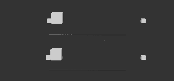
As technology and programming languages have evolved, animation in interactive design has begun to grow out of its infancy stage. With this maturation, designers are switching from animation’s previous use as a flashy addition to a more subtle benefit to the end user. One of the major improvements in animation that led to its evolution has been the switch from linear movement to interactions that reflect real-world properties like gravity, weight, and speed. With this progression, objects mimic their real-life counterparts and actions (such as swiping) feel more realistic.
How can we use it?
Okay cool, we’re all aboard the UI animation train. But where can we actually use it without it becoming too distractive? The common purposes for animation are to grab the attention of a user, let the user
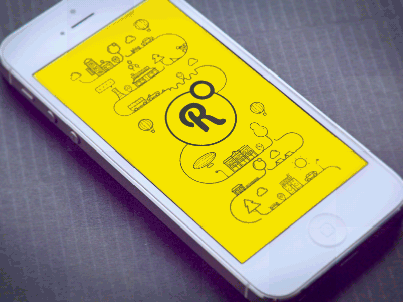
know of a change or transition, and to indicate a relationship between two different objects or forms. Transitions reduce the mechanical feel of a website and helps users identify that they are moving from one piece of content to another. This transitional implementation has become especially important in loading screens, a common spot for user frustration. By implementing creative animation in this spot, sites have the opportunity to pleasantly surprise users and prevent people from leaving. Aside from loading screens, subtle transitions can be useful when switching between two tabs, collapsing/expanding forms, and revealing additional content.
Downsides to Animation
Although UI animation clearly can have a positive impact on websites, designers must be wary of its downsides. The most common issue with animation on websites comes down to frequency. Too much of a good thing can surpass the annoyance threshold of users, ultimately resulting in a worse experience for them. In addition, designers must be careful about the speeds of their animations. Movement should only be rapid if its purpose is to redirect the attention of a user, otherwise it simply becomes too distracting.
Now that you know more about UI animation, we hope to see more (but not too much) of it in the future!