
5 Tips for Successful College Landing Pages
Five best practices to keep in mind while designing successful college landing pages and creating a page that converts prospects.
As a stand-alone page, the advertising landing page serves one purpose — to capture a lead or make a sale. The page isn’t trying to serve multiple audiences or convey various messages, its entire reason for being is to make that sale or capture users’ contact information so they can continue along the customer journey.
Following are five best practices to keep in mind while designing successful college landing pages and creating pages that truly connect with your users that were discussed at OHO’s 2019 Higher Education Digital Marketing Bootcamp.
1. Show Clear Paths to the Future
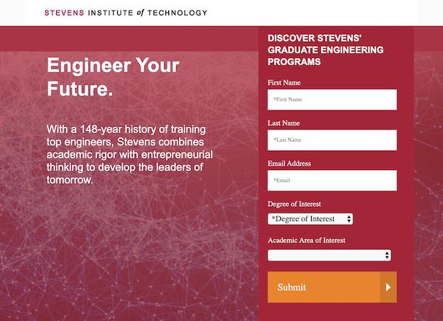
Earlier in 2019, Stevens Institute of Technology launched a new landing page to capture leads for their graduate program in engineering. When designing the page, they listened to survey participants who voiced concerns around affordability of the degree, if it would help them find a job after graduation, and if they could keep up with the academics. To address those concerns, they then ensured the page offered clear answers to these questions and demonstrated what a student’s future could look like after this engineering program.
2. Be Authentic
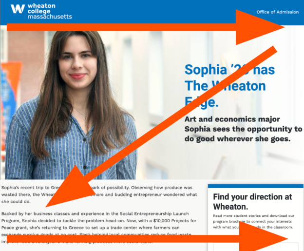
Users appreciate authenticity, not cheesy sales-speak. Show real students engaged in activities at your school, not posing in a staged photo shoot. Student testimonials should be short, specific and believable, and watch those headings when crafting your copy. Headings in copy should be descriptive and inspirational and not salesy or misleading.
3. Design a Clear Visual Hierarchy
Be sure to utilize user flow patterns when designing your landing page. Most of your users won’t engage with every piece of content on your site from top to bottom. Instead they skim, so “chunk” your content by using meaningful subheads, bullet points, and shorter paragraphs. This creates a good user experience and helps people get high-level information and then choose to learn more.
Also keep in mind how people scan a page. If a page is content heavy, readers scan in an F pattern. If there’s not too much content people scan in a Z pattern, moving their eyes left to right and then diagonally across. Use type, color, scale, and imagery to signal prominence.
4. Don’t Forget About Branding
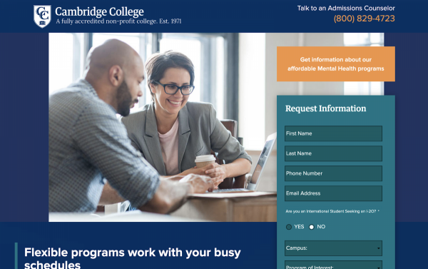
Provide users a high-level overview of your brand on your landing pages. They may not have seen your website yet if they are coming to your landing page via organic search or a link in an email. Make sure your logo is prominent on the landing page, and include important facts about your institution in your brand statement on the page.
5. Make it Dynamic
Your landing page is a stand-alone page, separate from your website, so have a little fun with it. Bring in your secondary palette and add more images, graphics, and colors to make it engaging for users. Don’t be afraid to add more photos of students actively involved in events on campus or alumni who are successful in their fields to draw visitors in, make them interested to learn more about your school or program, and help move them along in the customer journey.