5 Academic Program Finders Worth Copying (And What to Avoid)
We've rounded up some of our favorite college program finders to highlight best practices for helping prospects find the program and degree information they need to select your school.
Do you have my major or program?
That’s perhaps the #1 question your institution’s website should answer.
Higher education websites have come a long way from sprawling link lists of majors and minors. Yet, information about majors and minors isn’t always logically organized, neatly presented, or easy to find.
Enter the Modern Academic Program Finder
A well-designed program finder allows users to quickly identify an area of study or degree type and then easily find their way to additional information. These practical pages should be comprehensive without being overwhelming; features and tools usually include organized lists, filters, and search options.
Academic Program Finder Best Practices
Developing an effective, easy-to-use academic program finder is a critical part of many university website redesign projects. Based on our user research with prospective students, these are some of the design principles we recommend at OHO:
Use a Simplistic, Intuitive Design
Program finders should be scannable and easy to digest. Likewise, the tools/features (e.g., filters and sorting options) should align with the primary mental model of users and be simple to scan.
Concise and Clear Content
Keep degree or program content displayed to a minimum — just enough context to compel a user to continue to a program page to explore the degree in detail. The information presented should be complete enough so users can compare programs without a lot of clicking in and out of program pages.
Present Degrees/Programs in List Format
Our research shows that prospective students prefer a list view (like a directory) over more visual alternatives like cards and tiles.
A to Z Order & Logical Grouping
Alphabetical order is the most common listing format, and it’s also helpful for users who already have a program in mind. You might also consider breaking down your listings into smaller categories, like area of study, school/college, or even degrees that lead to certain professions.
One thing to keep in mind with alphabetical order are instances where the more common name for a program is an abbreviation — like MBA, for example. It’s a business program, so users might look under “B” or “M.”
Straightforward & Visible Filters
Keep your filter choices limited. It’s incredibly helpful to show which filters are currently selected — this gives the user more control over their search and gives them reassurance that they’re viewing correct results. Also, provide a straightforward way to remove filters. Ideally, activated filters are always visible and not hidden in drop-down filter listings.
Limit Visuals on Program Finders
Some of the most exciting campus imagery comes from labs and classrooms, but an academic program finder is not the best place to showcase those photos. We recommend against adding a representative image for each program listed; it doesn’t add value for the users on this page. In addition, keep the images and text above the program very limited. Let users get right to the program finder.
Clear Path to What’s Next
Ultimately, your program page is a tool. It can look beautiful and have lots of bells and whistles, but the end goal is to get your prospective student to an individual program page to learn more and, hopefully, request information or start an application.
College Program Finder Examples
While there are certainly best practices for developing user-friendly program finder pages, the features and functionality — the must-haves and nice-to-haves — will vary based on an institution’s needs, goals, and budget.
Here are just a few examples that illustrate the range of possibilities when designing an effective program finder:
Dominican University of California
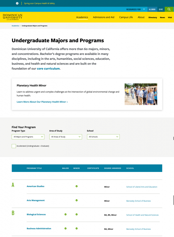
Dominican’s redesigned website features a vibrant color palette that carries through to a clean and crisp program finder tool. This page includes minimal intro copy, and also offers space for an optional spotlight program; on the day we took the screenshot, Dominican was highlighting its planetary health minor.
What we like about this academic program example:
- Clean, minimal design
- Active filter(s) displayed clearly
- Toggle option for accelerated programs
- Three main filters: program type, area of study, and school
Fredonia State University of New York
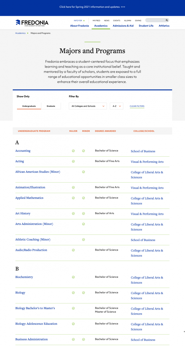
Fredonia’s program finder page is visually appealing and, with a quick scan, prospective students can get a high-level overview of majors, minors, degree types, and corresponding college/school.
What we like about this academic program example:
- Simple interface with few filters
- Clear indication of program type
- Straightforward audience pathways (undergraduate and graduate)
Roger Williams University
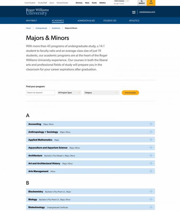
Before Roger Williams University redesigned their program finder, multiple program listings were used across the site, with each school and department using a different presentation. The newly designed single interface improves overall usability and content management. To help prospective students explore programs without leaving the program finder, each major or graduate program includes a short description.
What we like about this academic program example:
- Clear A to Z order
- Search within program listing
- Scannable information for quick browsing, with option to reveal more content through an expand/collapse menu
- Single click to clear the filters
U.S. Naval War College
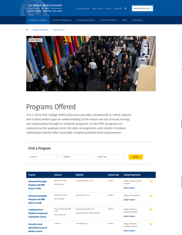
Military and civilian leaders who visit the U.S. Naval War College website are likely to be seeking a specific credential or degree in mind, so this program finder is designed with an emphasis on eligibility and degree/credential awarded.
What we like about this academic program example:
- Filters focus on top user questions — and is mindful of their time
- Table format offers quick view of program/student types
- Clear CTAs to program page
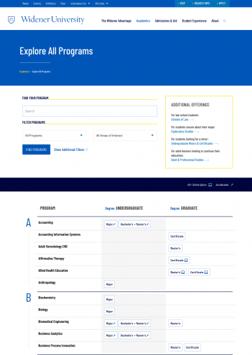
Widener University
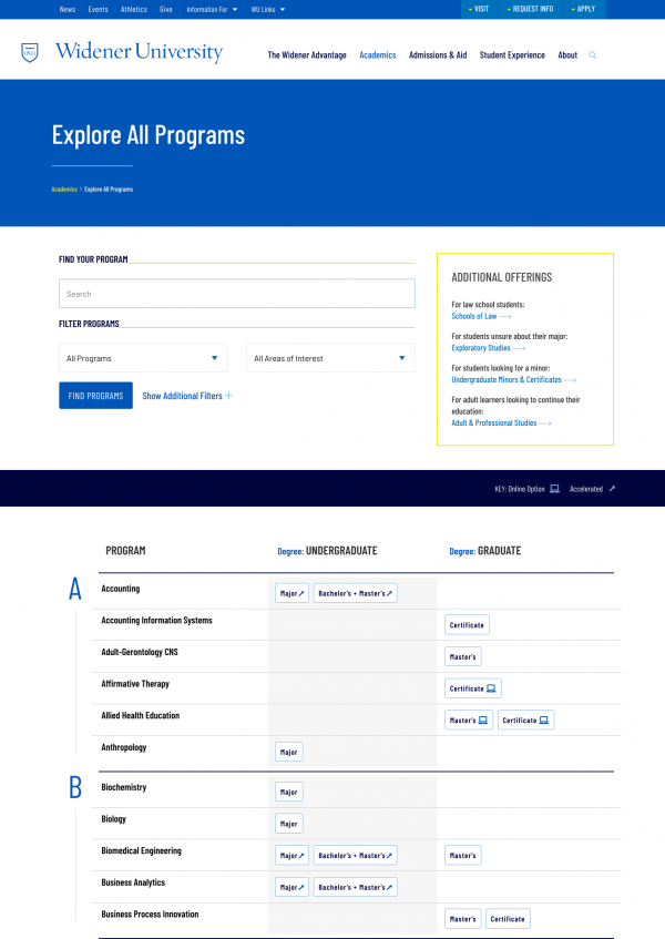

Widener’s Explore All Programs page is flexible: Users are immediately presented with options to search or use filters to find programs. An “additional offerings” box provides an easy pathway for additional student types.
What we like about this academic program example:
- Clear delineation between undergraduate and graduate programs
- Iconography used effectively to provide further detail
- Advanced filtering options available
How to Know When (and Why) Your University Program Finder Needs a Redesign
Keeping best practices in mind, it becomes easier to spot opportunities to create better experiences for prospective students. To help illustrate, we identified a few college program finder pages that — at the time we visited the site — could benefit from an overhaul and why.
Additional Clicks & Confusing Paths
Your Academics landing page or main Majors & Minors page should instantly and easily communicate your offerings. However, many institutions put a few extra steps between the user and the information they’re looking for.
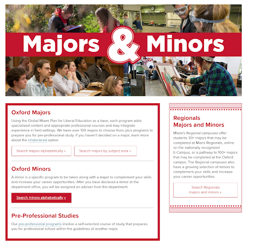
Example: This Majors & Minors page presents users with multiple options: You can go to a page for an alphabetical list of majors or go to a page to search by subject area; minors are on a completely different page. Additionally, there is a link off to pre-professional programs as well as to regional campus offerings.
Cumbersome Navigation
Card-based navigation works for many things, but it might not be the best choice for an academic program finder, especially at a school with scores of options. This could result in endless scrolling or cumbersome pagination.
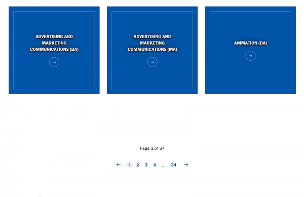
Example:
This tiled design allows only a few programs on each page. The program finder does offer a search box and filters, but the casual searcher would need to click through more than 30 pages to view all of the programs.
Emphasis on Organizational Chart
Institutions of higher education have an academic hierarchy; while this varies from school to school (and by type and size), you’ll find levels like: university, school, college, division, department, program. That’s a lot to take in when you’re a prospective student, and a program finder page isn’t the best place to introduce these silos. When you do, it can get clunky and confusing.
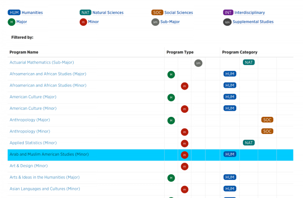
Example 1: This school offers a program listing table with colorful icons representing the four major areas of study (humanities, natural sciences, social sciences, and interdisciplinary) and the degree/program type (major, minor, sub-major, and supplemental studies.)
The result is a table that’s overwhelming visually, and a bit of information overkill. For instance, prospective students might not see a clear difference between humanities and social sciences.
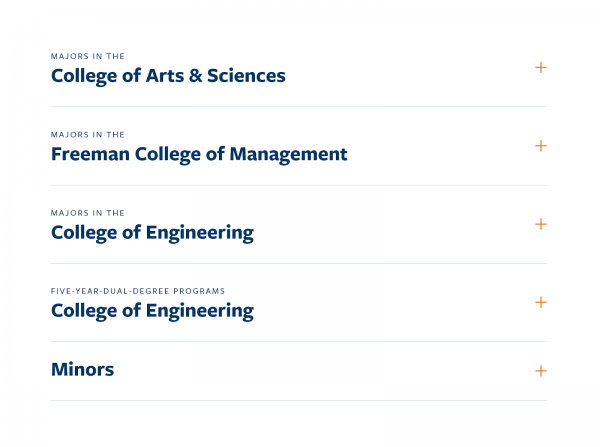
Example 2: Some schools present offerings accordions, one for each college. Additional drop-downs show minors and dual-degree programs.
In cases like these, it’s important to display pertinent information clearly, which does not necessarily mean sorting by an overarching academic division.
Out-of-Order or Illogically Ordered
In the laws of alphabetical order, numbers precede letters. In theory, that might be correct. But, in practice, it poses a challenge for dual-enrollment programs such as a 4+1 pharmacy degree.
Example:
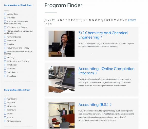
This school’s program finder defaults to alphabetical order, so its 3+2 Chemistry and Chemical Engineering program is listed first, before Accounting.
It’s easy for a prospective chemistry major to scroll right on by, looking for the “C” section. (It’s worth nothing that this program finder does have alternative ways to find the chemical engineering degree: it’s listed under “Engineering 3+2” and can be found using a variety of filters.)
In cases like these, it might make sense to reconsider what you call a program for the sake of easier organization.
Other Considerations: Naming Conventions, Silos & SEO
Deciding how to list your majors, minors, and programs — or rather, what to call them — can be challenging.
What colleges and universities officially name their degree programs might not always align with how today’s students would search for them, either by scanning through an A to Z list or typing in a query into a search box. We encounter this quandary quite a bit in our day-to-day work with higher education clients. Focus groups, SEO research, and other data can help make the case for “friendlier” names in program finders lists. (And other content marketing efforts can help capture alternative search terms.)
Additionally, as the lines blur between traditional and nontraditional students, it’s clear that prospects might not always fit into a neat undergraduate, graduate, part-time, full-time, online, or on-campus box. (For example, some institutions offer all undergraduate degrees online and many graduate programs are residential.) Thus, it becomes even more important for an all-inclusive program finder when it makes sense.
If you’re embarking on an academic program finder development project, conversations like these are important for buy-in across the table. (And it’s a topic that might warrant a blog post of its own someday!)
Want to Talk More about Academic Program Finders?
We’d love to show you how you can answer your prospective student’s top questions, including finding their ideal major with the help of an intuitive, user-friendly program finder. Set up a time to talk with us here.