
Health Insurance Website Plan Finder User Test Results
As health insurers embrace digital transformation, designing and developing a plan finder is a central website component that needs to be tested and refined to ensure customer satisfaction. We conducted user tests on three plan finders to establish baseline feature expectations.
User Test Plan and Goals
We conducted an unmoderated user test to understand the prioritized needs of users and users’ interface preferences when engaging with online plan finders to conduct research on health insurance plans.
We selected three insurers for the test:
We selected these health insurer websites because they each offered different user interface designs, the interfaces were robust and sophisticated, and each insurer offered a wide range of products that would require use interface to find the requested product.
Participant Demographics
We engaged 20 users between the ages of 30-60 located in the United States. All of the participants had enrolled in health plans previously. All of the tests were conducted on desktop browsers (no phones or tablets).
User Test Task:
For each health insurer website, users were given the same task:
Imagine that you are looking to purchase a new health insurance policy (not dental, vision or medicare). You are considering enrolling in an INDIVIDUAL or FAMILY plan directly from the company (not through your employer). Please find the individual or family plans and find the plan with the lowest out of pocket cost.
The task was able to be accomplished on each site. The task was designed to be sufficiently complex and detailed that it required the participants to carefully use the interface.
User Test Presentation — Video Results
More detailed findings of the user test are available in a video presentation including specific interface evaluations and user videos.
Survey Findings
Before beginning the user test using the three live, publicly available health insurance sites, we asked users a set of questions about their preferences, influences and decision making process.
Prioritized Needs: Price Matters Most
The number one need for users: price — and it needs to be a clear, transparent price presentation. Providing immediate access to the cost — while requiring the least amount of personal information — was preferred.
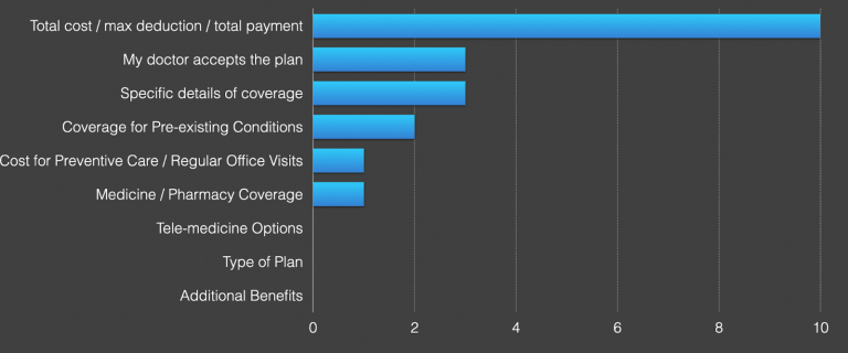
Participants also wanted to be able to quickly understand if their doctor accepted the insurance and, more importantly, how much coverage would be provided.
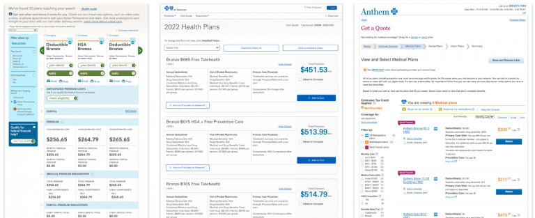
While the Blue Cross Blue Shield of Tennessee offers a full-featured plan finder, participants raved about this simple table that summarized the offers.
Once users winnow down the plans by payment and doctor acceptance, the details of coverage are important. The remaining factors tended to vary by individual healthcare needs.
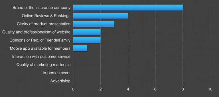
Influencers in Health Insurance Plan Decision Making
The top influencer in the decision making process is the brand of the insurance company — familiarity and reputation provided comfort to participants. This reputation may be informed by online rankings/ratings — usually if they had not heard of the company — and this reputation is also informed by opinions of friends or family members.
3 Insights from User Tests for Health Plan Finders
Our team reviewed the 20 recordings to observe how users attempted to complete the tasks. From our analysis, we discovered a number of key themes including these three.
Users Want to See Plan Options Quickly
Most plan finders collect personal information before presenting the available plans. Users rush through this process of sharing information — opting out of any step that gets in the way. Here on the Anthem site, every user clicked “Skip This Step” to move forward in the process and get to the plans — even though Anthem is trying to educate the user about discounts.
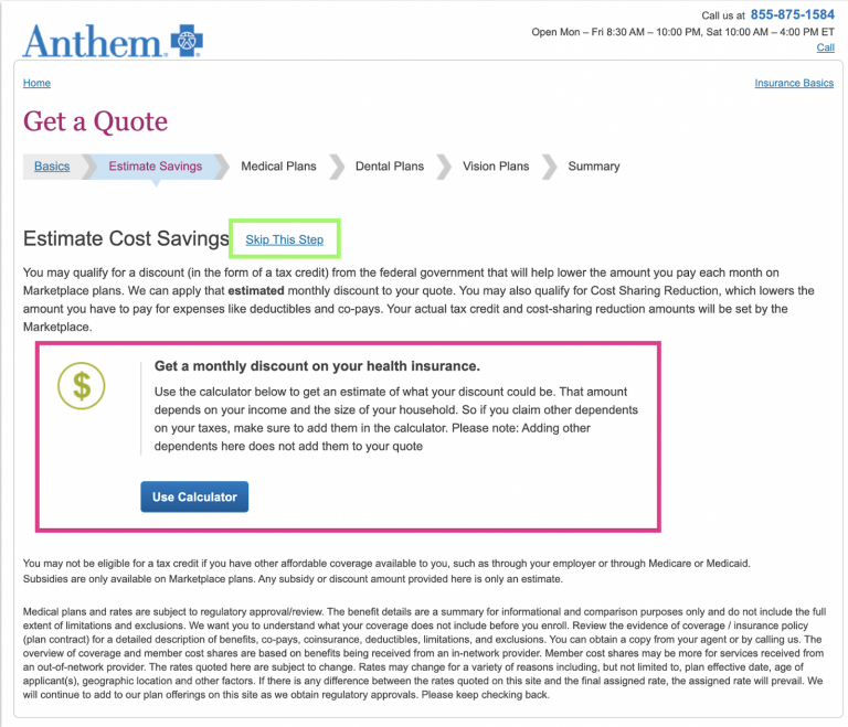
Take away: Help users understand the plan options without pricing earlier in the process. Also, do not try to communicate critical information in this user flow — it is ignored.
Figuring Out Filtering
While users ultimately rated the Kaiser Permanente site the easiest to use to find health insurance, the user videos show that numerous parts of the interface went underused, and many users were not able to complete the task.
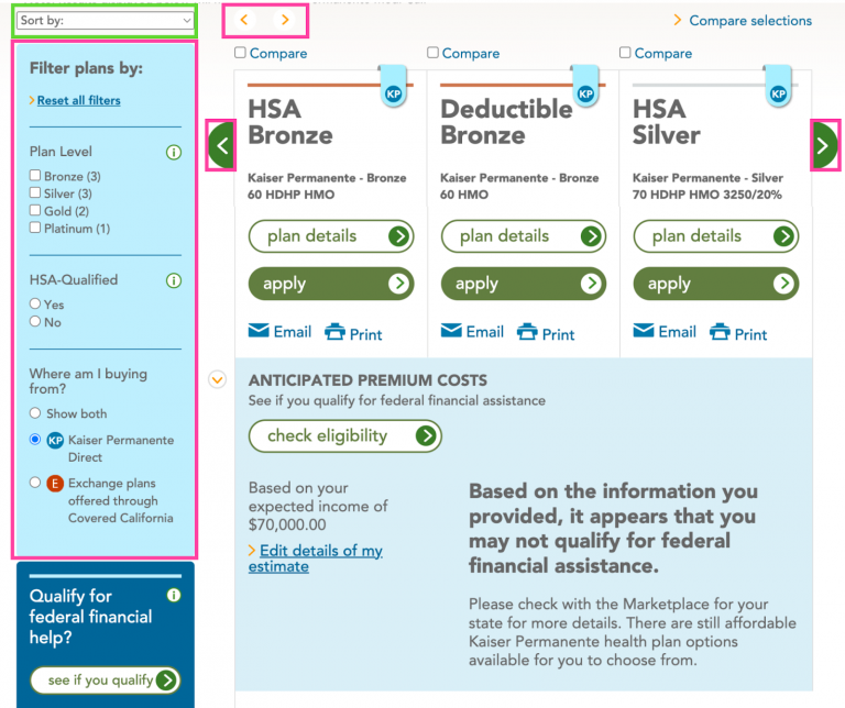
The left and right navigation arrows to scroll through the plan were frequently ignored.
At this point in the research process, users strongly prefer simple filters — such as the “sort by” drop down — that allow them to quickly see the least expensive option. While the plan finder on all three of the test websites offers full featured filters, users largely ignored these opting for a scroll and browse approach.
Keep It Simple
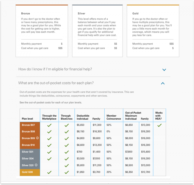
Users appreciated the more structured content in the Blue Cross Blue Shield of Tennessee website (shown in the center). The content is easier to scan and access.
User Recommendations on Health Plan Product Finders
Following the completion of the review of the three plan finders, we asked participants a series of questions including open-ended suggestions for how to improve.
4 Key Recommendations for Health Plan Finders
Easier Path to Plan Finder (5 responses)
- “The best route from point a to b is a straight line. This applies to websites as well.”
- “Make a quick link at the top of the website home page to shop plans”
- “I would like to get to the insurance info/comparison screens quicker.”
- “Just one click that gives me a table with all the relevant information for all plans so that i can compare each one”
- “Just show the plans on the first page”
Reduce Amount of Personal Information Required (5 responses)
While most users acknowledged the reason for providing personal information is to receive a quote, they did not like having to supply their personal information to simply see a product listing.
- “I would have a shortcut to get to the plans without questions about income or other advertising.”
- “Having a direct quote option instead of having to click through links.”
- “Reduce the basic information required to get to a point of comparing plans”
- “Do not ask intrusive questions about my info BEFORE giving me info on the various plans.”
- “Not having to enter in so much information.”
Plan Finder User Interface (5 responses)
Remembering that all of these users are engaging at the top of the decision making process, they longed for ways to be quickly oriented and understand the options.
- “Have the select box more obvious and sort by options for results.”
- “Make it easy to compare plans at a glance”
- “Consolidate the plans for comparisons”
- “Always have a comparison chart detailing all relevant information.”
- “Having a lowest price filter.”
Navigation & Wayfinding (4 responses)
- “Simplify navigation”
- “Easier navigation on the homepage.”
- “Better menu options”
- “Easier paths to follow”
Secondary User Needs
Suggestions from users also included:
- Improving the overall design — especially with comments around font size and color
- Content — users commented on the jargon
- Chat — although all of the sites offered chat, users often missed this desired feature
- Readability — from language to font size making the content easy to read and understand was important
Recommendations for Improving Health Plan Finders
- Usability Testing: All of the sites tested have very basic usability issues that prevented users from even getting to the plan finder. We recommend a baseline usability test to discover and fix rudimentary barriers to access
- Visual Design: Limit the amount of text on the pages, use white space to improve clarity, and use consistent color and styling for action buttons
- Filters: We’re seeing users at the top of the research activity not using the filters to sort or drill down on the list. We recommend keeping these simple and clear. Also, provide users with simple plan tables to be used at the start of the process. Additional testing on the use of filters with users further down the decision making process should be conducted.
- Contextualize Price: The initial reaction to the cost is some shock and intimidation. We recommend finding ways to contextualize and understand the costs — and how to make adjustments to find the best plan at an affordable price.
- Comparison: Provide methods to easily compare plans. Users want it.
- Orient Prospects: Help them get oriented to plan offers and pricing in a simple presentation.
We can help improve your online customer satisfaction and conversions. We're a team of 60 strategists, creatives, and technologists helping healthcare and health insurance marketers improve their web and digital marketing strategies. Learn more about our UX, content, and development services for healthcare and health insurance.