
8 Best Admitted Student Websites
The admitted student site is a key touchpoint to connect with admitted students and convince them to enroll. Here are some of our favorites.
Once regular decision deadlines pass, it’s time to shift focus away from application numbers and hone in on the next crucial metric toward hitting your yield targets: enrollment. You only have a few weeks to convince prospective students that your school is the best fit for them, so it’s time to pull out all the stops.
While there are many touch points along the prospective student journey that ultimately lead to enrollment, the admitted students website is one of the last touchpoints to influence a school’s overall yield rate.
Key Content for Admitted Students Websites
- Clear steps and checklist to enroll
- Student outcomes
- Well-organized video playlists
- Highlights of dining and housing
- Promote in-person and virtual events
- Ways to connect and get questions answered
While some admitted student sites are completely independent of the main .edu, the majority utilize the same templates and design language admitted students would already have encountered earlier in their student journey. This approach places admitted students on familiar footing, making it easier for them to navigate new content now that they’re in the final stages of the decision making process. That said, there are some benefits to creating a standalone experience, which we’ll discuss later in one of the example sites.
Boston College
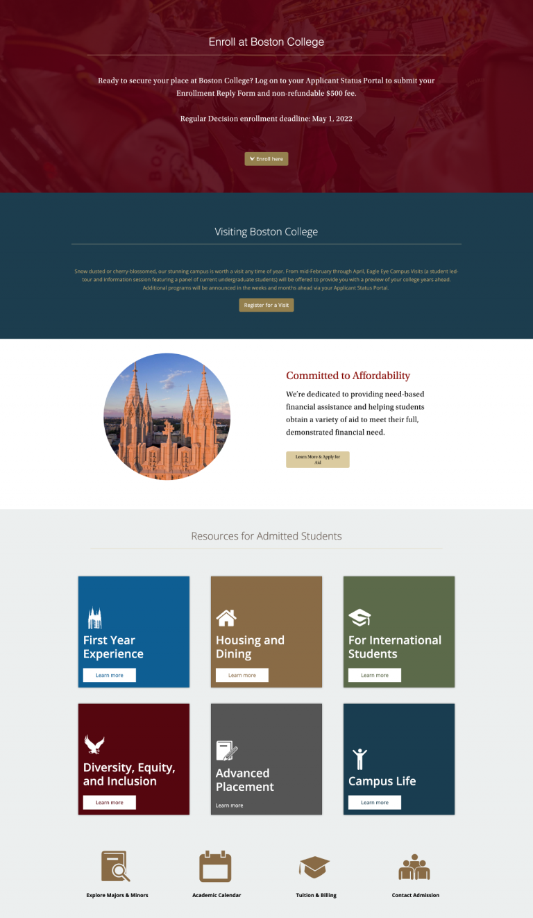
To craft a stellar admitted student site, it’s best to provide prospective students with everything they need to help them make an informed decision, without drowning them with too much information — and Boston College’s site threads that needle exceptionally well. While the site looks simple at first glance, the site presents a wide range of content that doesn’t overwhelm the visitor.
Highlights include a “Resources for Admitted Students” section that provides prospects with a simple grid of essential information — housing & dining, campus life, information for international students — broken down by category, and an “Admitted Students Playlist” that directs prospects to a catalog of videos from students, faculty, and alumni detailing every aspect of the Boston College experience.
Best for: Video playlists
Bloomsburg University
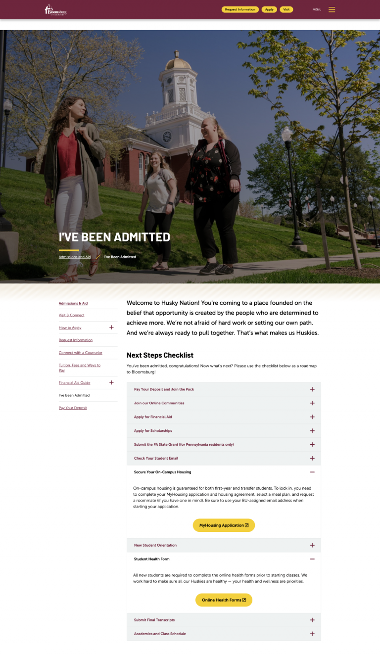
When prospective students are ready to make their final choices, one of the most overwhelming aspects of the process can be not knowing what the next steps are — and when they need to happen. Bloomsburg University’s admitted students website clarifies next steps with an informative and intuitive checklist at the top of the page outlining precisely what prospective students need to do to enroll. A well-structured navigation allows prospects to choose the areas they want to explore in greater detail.
The rest of the page is dedicated to housing and dining — areas that our research suggests are particularly influential for prospective students — and a small area highlighting additional resources.
Best for: Intuitive checklists
Illinois Tech
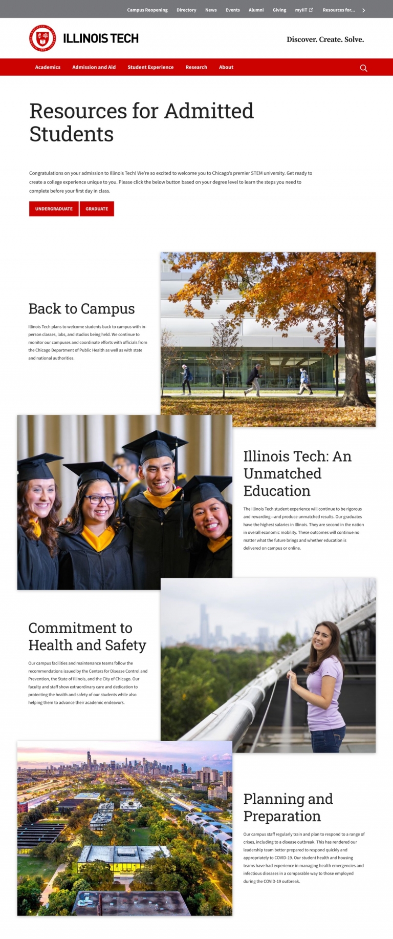
While many admitted students websites in our list take the “less is more” approach, Illinois Tech goes squarely in the opposite direction. There’s a ton of content to digest, including event listings, internship opportunities, peer mentorship, campus life, and more (there’s even a Discord server). But the site design heralds visitors through the content in such a natural, organic way that it never feels overwhelming.
Best for: Content architecture
Simmons University
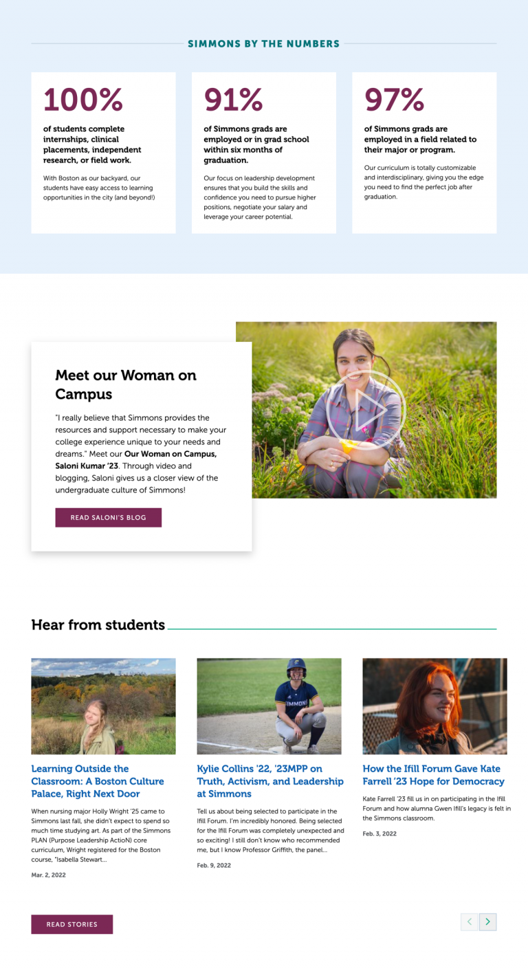
The majority of prospective students cite future employment as their primary driver for pursuing higher education. Despite that, few admitted student sites we reviewed put enough emphasis on student outcomes. Simmons University in Boston, however, does an outstanding job of highlighting all of the opportunities prospects have on campus as a student, as well as what they can expect after graduation.
The site also relies heavily on student storytelling to provide prospective students with first-hand accounts of what they can expect from their experience should they choose to enroll at Simmons.
Best for: Student outcomes
Widener University
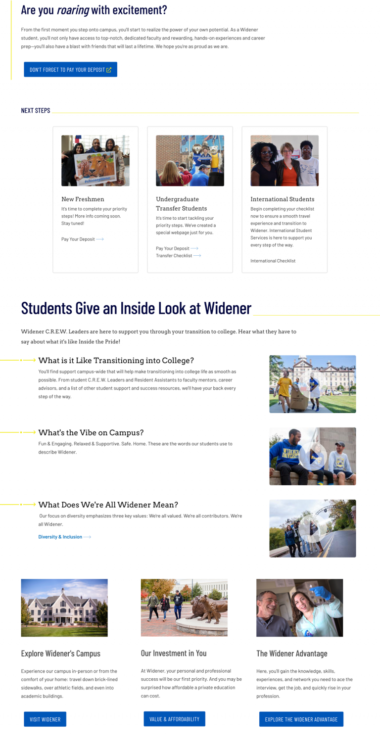
There is no better way to showcase what makes a school great than to let existing students do the talking, and Widener University’s admitted student site is a case study in how to do that well. Instead of inundating prospective students with hours of video content, Widener focuses on a few key questions prospective students are likely to have and provides short, succinct answers in the form of student testimonials.
The site is compact, and simple to navigate, but provides prospects with clear paths to access additional information if they still have questions after visiting the site.
Best for: Video testimonials
Williams College
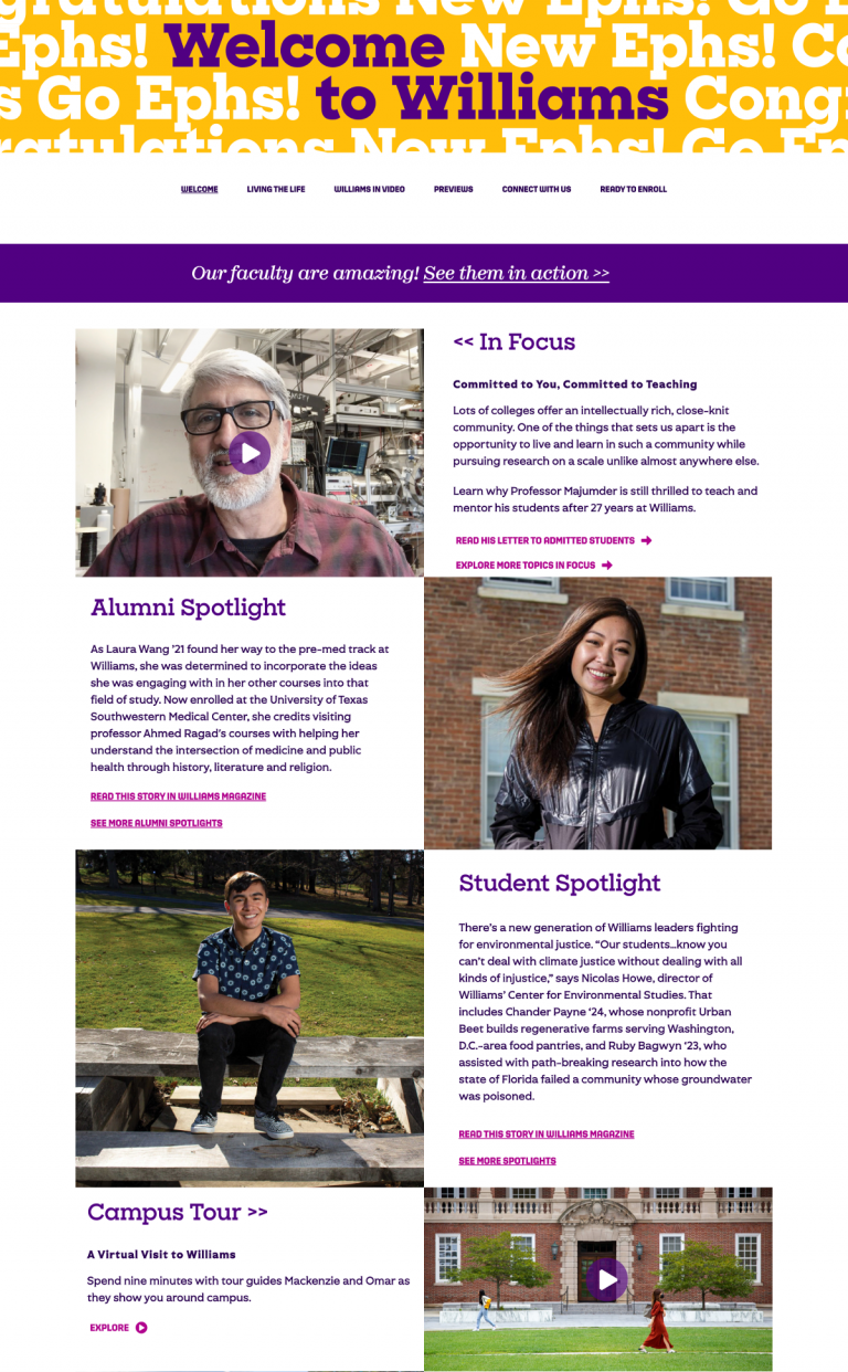
Of the admitted student sites we reviewed, Williams College's was the only example that wasn't incorporated into the school’s main website. Instead, Williams College opted to build out an admitted student site that’s completely separate from their main .edu. While this approach can trip up returning visitors who were already familiar with the school's site design and navigation, it does prevent admitted students from veering off into other areas of the site. Keeping the admitted student site separate allows Williams College to keep them engaged only with content that’s most relevant to them.
There’s a clear progression for how admitted students should engage with the site, beginning with a welcome page and then moving along to other areas of interest like campus life and connecting with current students before culminating in a CTA to enroll.
Best for: Standalone site infrastructure
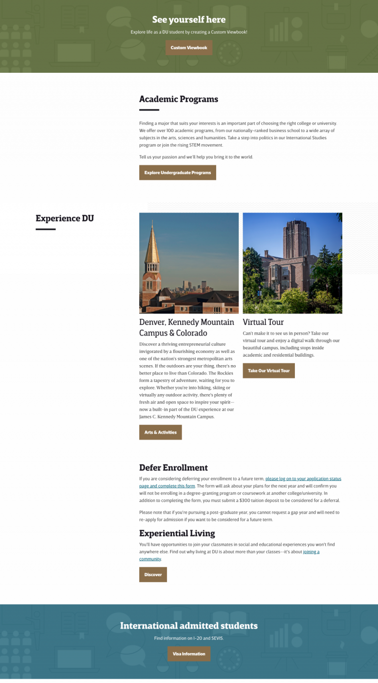
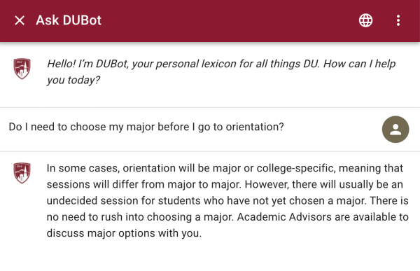
The University of Denver
The University of Denver’s admitted student site has two unique features that set it apart from all of the others we reviewed.
First, they have an automated chatbot called “DUBot” that admitted students can query using conversational language. Chatbots are very difficult to do well, but the DUBot tool has a surprisingly robust library of information compared to others we’ve seen. For example, a query for “Do I need to choose my major before I go to orientation?” yields a relevant, detailed response — instead of the all too common, “I’m sorry, but I don’t understand the question. Could you try rephrasing it?”
The University of Denver has another cool feature in the form of a personalized viewbook that’s built on the fly based on areas of interest the visitor selects. It’s a great feature that allows admitted students to hone in on the areas that will most impact their decision and decide whether the University of Denver is the right fit for them.
Best for: Personalization
USC
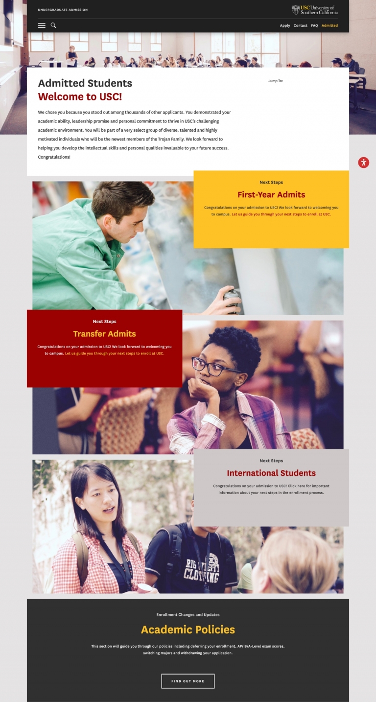
While many admitted student sites prefer to let visitors explore on their own, USC’s site provides a much more guided and curated experience. The homepage breaks users up into one of three categories — first-year admits, transfer admits, and international students — and immediately shuttles them to a page outlining next steps to enroll along with deadlines to help admitted students move along in the process.
There’s additional information to be found on essential information like housing and campus life, but the site is clearly designed to keep admitted students focused on the path to enrollment. Which might not be the ideal experience for every visitor, but for prospects that have already made up their minds, it’s a great approach.
Best for: Next steps