
Promoting Student Outcomes on Your Higher Education Website
Every school wants to stand out. But what if one of the most meaningful ways of standing out aligned with one of the top questions prospective students and their families have about your school?
With increased scrutiny around the ROI of a college degree, demonstrating tangible outcomes is more important than ever. Prospective students and their families are thinking about life after college — what kind of jobs might a graduate get, how easy is it to get that job, what kind of career can I begin, how much will I earn?
These details, when presented well and contextually, make a compelling argument for the value of the educational experience you offer. And the research bears this out:
-
In the 2019 survey of American college freshmen [PDF] administered by the Cooperative Institutional Research Program at UCLA’s Higher Education Research Institute, 83.5% of first-year students indicated that being able to get a better job was a “very important” reason for deciding to go to college — the most popular reason cited.
-
In the same survey, 54.8% of respondents indicated that the fact that graduates from a certain college get good jobs was a “very important” reason for deciding to attend.
-
According to the 2019 Ruffalo Noel Levitz E-Expectations survey, the fourth-highest influencer for high school students researching a college was salaries attained by recent graduates.
Different types of outcomes include:
-
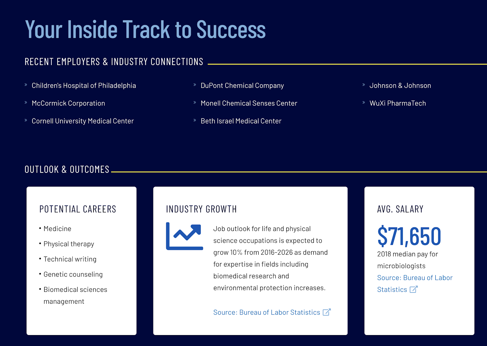
Career outcomes: job titles or lists of employers
-
Financial outcomes: starting salaries and loan repayment rates
-
Academic outcomes: graduate school acceptances, average scores or passing rates for credientialing exams (e.g. NCLEX, LSAT), fellowships, and scholarships
But there are many considerations when it comes to communicating outcomes effectively and impactfully. Here are some of the most important factors to keep in mind.
Finding Powerful Data Sources
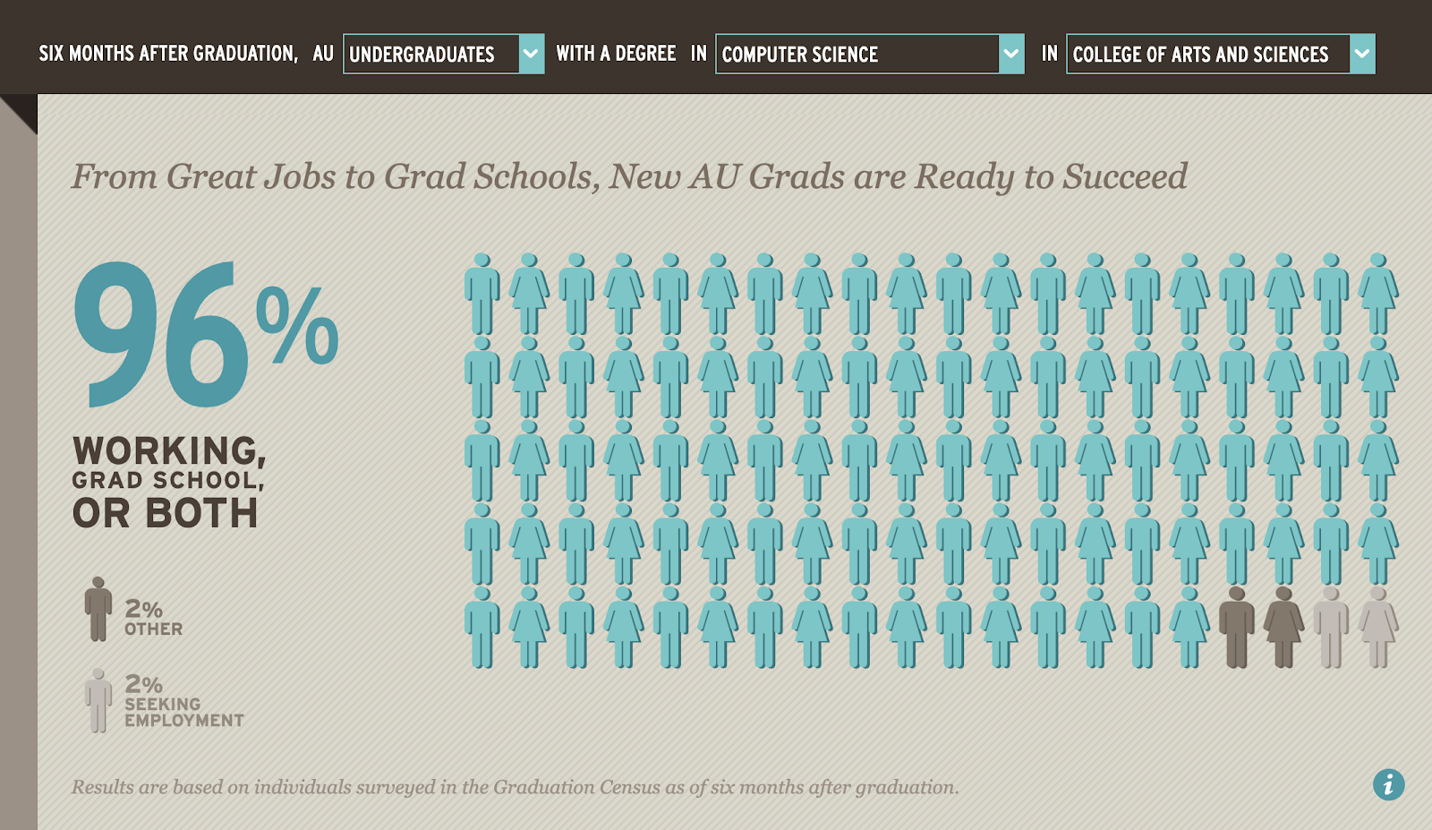
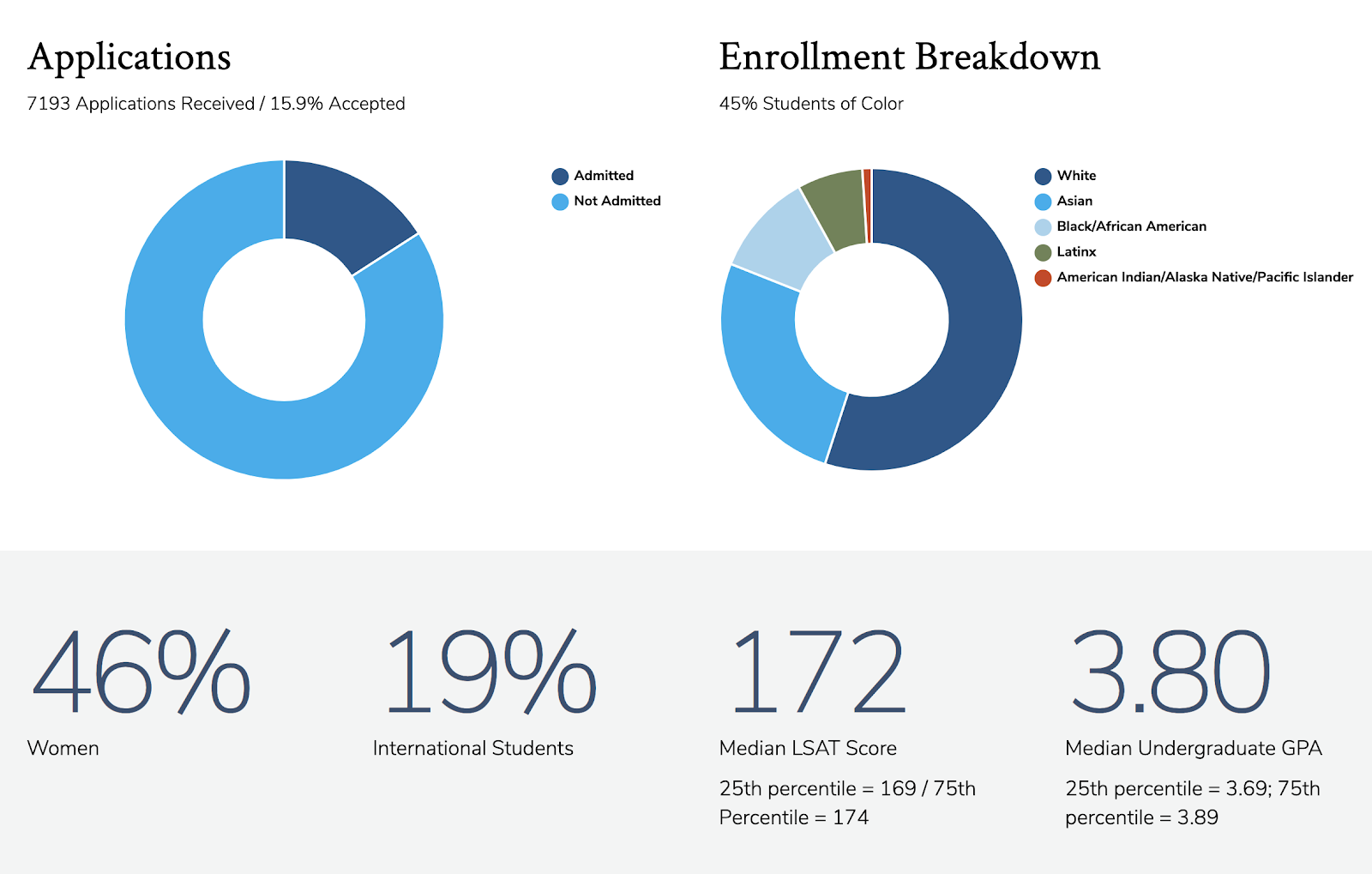
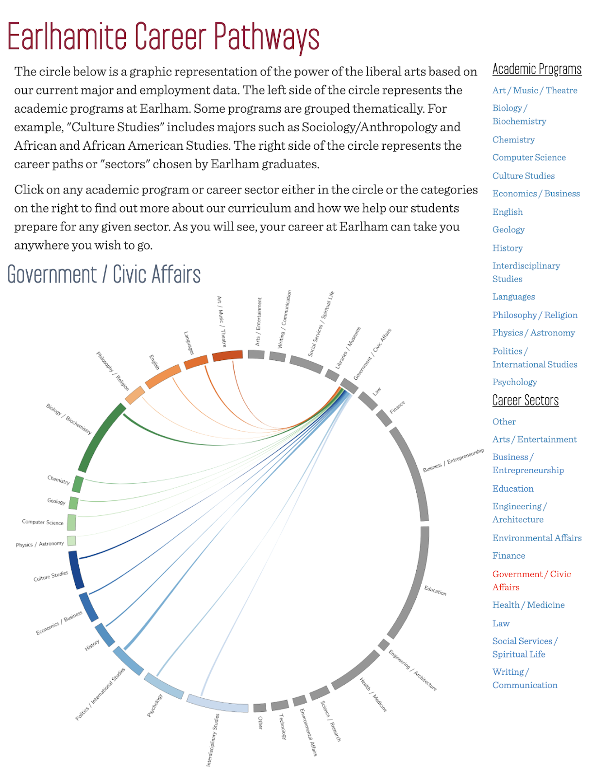
In a previous blog post, we wrote about the value of post-graduate outcome surveys, typically administered by the career services office, as a source of outcomes data. Lurking in the results are the stories about how your institution prepares students for their life after graduation — maybe it’s the internships, maybe it’s the alumni connections, maybe it’s the longstanding relationships with local employers.
Not all surveys are created equal, however — it’s one thing to be able to share outcomes at an institution-wide level, but it’s a whole other thing to be able to present outcomes at the program-specific level. This degree-level detail can really bolster your narrative about your program and to help differentiate it.
But to do this, you have to collect data with program-level specificity. And your method needs to account for the range of relevant information, from salary and employer data to participation in study abroad or internships, and everything in between. Basically, the more data you have, and the more parsable it is, the more you can do with it.
Establish Productive Partnerships

To get the data you need to market your programs and promote student success effectively, you have to cultivate productive partnerships with key offices around campus. Career Services and Institutional Research are likely keepers of the data (and in the case of Career Services, administrators of the postgraduate survey). Your provost or VP of academic affairs may also be a relevant partner.
Sit down and talk with these groups about what data is available, how your institution might improve data collection over time to serve multiple business purposes, and how you specifically want to use this data for digital marketing purposes. You will also need to ensure you can get access to the data reliably and in a timely fashion, in a format you can easily adapt to create content.
You can complement your own statistics with industry stats from agencies like the Bureau of Labor Statistics or industry-specific associations, and you can benchmark against national averages derived from sources like the First Destinations report [PDF] from the National Association of Colleges and Employers.

Putting Your Outcomes in Context
There are multiple types of context to consider when thinking about utilizing outcome data on your website.
Pit Your Data Against the Competition
Data means more when placed in context. If 92% of your graduates find jobs within six months of graduation, so what? Is that higher or lower than the national average? State average? Other public or private institutions? Your direct competitors?
The more you can put your outcome data in this kind of context, the more impact you can wring out of already strong statistics. It’s a bold move, for sure, but it can bring high reward.
If you are a private institution competing against a public institution, you may be able to find your competitors’ data and determine if your outcomes win in a head to head match. (States like Texas and Indiana have created robust outcomes dashboards for institutions in their systems.) Or you can compare using the U.S. Department of Education’s College Scorecard. In the interest of accuracy, just be sure you’re comparing apples to apples and not to, say, pears.
Place Outcomes Strategically Across Your Site
The second type of context to consider is in what section of your site you promote your outcome data. An institution may have great outcome stats to share. But if those stats only live on a Career Services department site, or an Institutional Research site, they reside outside the typical user flow of a prospective student and will not yield any impact.
By presenting this data along the context of a primary user flow — on a homepage, program pages, virtual tour, relevant email, or social content — it can do a lot more work for you and your recruitment and marketing objectives.
A program page is a uniquely powerful context in which to present your outcome data, If you are able to collect outcome data at the program-level, it can go a long way toward bolstering the narrative about your program’s value.
Pair Strong Data with Compelling Personal Stories
The third type of context is a communications context. One of our top content recommendations to clients is, “appeal to emotion, validate with fact.” This roughly translates to the powerful one-two punch of stories and data. Telling a great story about a graduate’s journey to a desired career outcome is made more believable when coupled with stats that tell a broader institutional story of strong outcomes beyond this one person’s experience. The stories and the data are mutually validating, each strengthening the impact of the other.
Also, how do your outcomes validate your value proposition? How do they reflect or reinforce some truth about your brand? These elements should all be working in concert as part of your communications approach to appeal to prospects.

Don’t Get Confused With Other Types of Outcomes
A fourth contextual consideration is the way that the word “outcomes” is used in higher education.
“Outcomes” are often referenced in a pedagogical sense, typically by academic departments or provosts, to convey the desired learning objectives of a given program.
This information has value in the context of the catalog, accreditation, and academic leadership, but has very low value for prospective students and their families trying to understand what their post-graduation prospects may look like.
Be sure that you are mindful of how the term is being used across your site, both from an SEO and a site navigation perspective.

Visualizing Data Meaningfully
Data visualization is an art form. But while some visualizations are quite elegant and may present data with great accuracy or nuance, they may not be effective at clearly and efficiently communicating to your user. And if the visualizations don’t meet web accessibility standards, your data narrative is dead on arrival.
Don’t visualize for the sake of visualizing — use visualizations where they add the most communications value. Ensure that your visualizations are easy to comprehend, are sustainable to maintain as new data is collected each year, and meet web accessibility standards for desktop and mobile.
Powerful tools like Tableau can allow site visitors to manipulate and filter large data sets, but make sure the options enhance the user experience and are easy to scan. Watch out for making data overwhelming.

Outcomes: A Powerful Communications Tool
With the ability to contextualize your institution against the competition, differentiate your offerings and your graduates, and quantitatively demonstrate the quality of your education, showcasing outcomes can be a powerful approach in your communications toolkit. However, as with all things, there is a lot of background work necessary to pull this off — establishing key internal partnerships, creating reliable flows of data from authoritative sources, and being able to sustainably maintain outcome data for currency and accuracy.
But you know what? A powerful stat wins out over floral prose any day. So we recommend putting in the work to sustain effective communication of your outcomes.