A Profound Sense of Place
After completing a rebrand, Dartmouth sought to create an admissions site that effectively told the story of what it truly means to attend Dartmouth. We helped them craft the first expression of the brand, and to meet their enrollment goals of increasing applications, adding socioeconomic diversity, attracting more international students, and creating a site experience that would serve as a paradigm for what a college admissions site could — and should — be.
- Higher Education
- Website Redesign
- Content Strategy
Services
- Strategy
- User Experience
- Visual Design
- Content Strategy
- CMS Development
- Ongoing Support

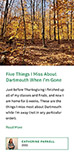
Leading with Student Voices
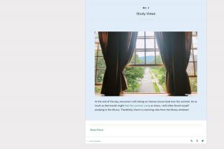
The primary brand pillar for Dartmouth is: A Profound Sense of Place. This pillar created an admissions challenge: how do you increase enrollment among prospective students that can’t travel to campus to experience that sense of place? The solution – lead with first-person stories and photo galleries from over 30 current student bloggers. Their stories are the foundation of the content strategy.
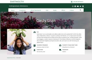
Detailed Profiles
The micro-content in the profiles is highly specific, highlighting key courses, study abroad opportunities, and internships.
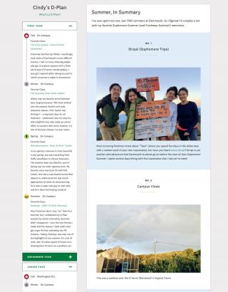
Explaining the Dartmouth’s Unique Curriculum
Each student’s individualized D-Plan is included in the profile to help prospects understand the flexible academic calendar that is a pillar of Dartmouth’s academic model.
Flexible, Genuine Storytelling
Student bloggers have access to a variety of social style post formats to highlight their adventures.

Distributing Student Stories Across the Site
Each of the posts created by the student bloggers is tagged and reused across the site. This strategy infuses personal stories into boilerplate and evergreen content pages.
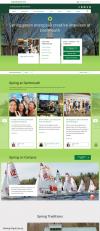
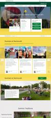
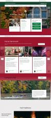
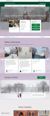
The Four Seasons of Dartmouth
The design and content of the visit page changes dynamically with the seasons, to further solidify a sense of place and to embrace the always changing New Hampshire weather. Each season is populated with large photo galleries, immersive images, seasonal blog posts, and news stories.


Simplifying the Application
The application process pages were notoriously confusing, repetitive and text-heavy. To reach international and first-generation prospects, it was imperative that the new application page be as clear as possible. The application flow now changes dynamically depending on the self-identified path of the user. It reveals only the content specific to that prospect segment to make the process as clear and streamlined as possible.
We also created an interactive glossary with contextual rollovers that allows the Dartmouth team to define admissions jargon for first-generation prospects.


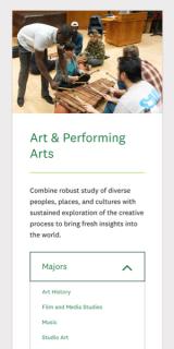
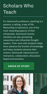
Elevating Academics and the Faculty
One of the challenges Dartmouth admissions faced was that all of the academic content was located within the department websites. This created a fragmented user experience for prospects. To overcome this problem, we designed a richly visual academic section of the admissions site that introduced the various academic pathways, highlighted the faculty, and used the student stories to bring the student experience alive.

Our Process
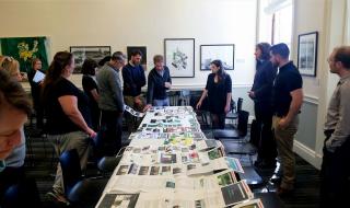
At the start of the project, we interviewed current students and sat down with internal stakeholders to determine the best path forward for creating a content-rich experience for prospective students.