Explained in 60 Seconds: Flat Design
Welcome to the simply satisfying world of flat design.
For years, web designers had found a way to embed all different types of textures, shadowing, and gradients into their work to demonstrate their creative prowess. However, more recently this style of web design has begun to fade away in order to find room for a trend - and maybe even a revolution - that finds a better balance between aesthetics and usability. Welcome to the simply satisfying world of flat design.
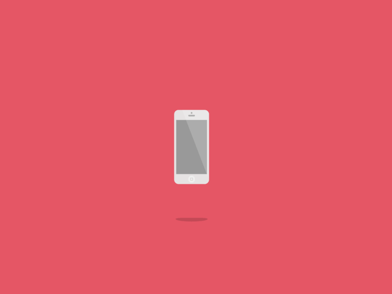
As a formal definition, flat design is the style of interface design without any stylistic elements that give the illusion of three dimensions, putting an immediate focus on the minimalist use of simple elements, typography, and flat colors. The removal of these additive elements allows designers to create a crisp and modern-looking style that naturally puts more emphasis on the content embedded within an interface. Flat design isn’t used just for the purposes of being minimalistic, but to enhance the user experience of a website or product.
So, how did flat design come about? While there is no official timeframe for the adoption of flat design, some of its elements were first scene in the 1940s and 1950s with the introduction of the Swiss style of design. Similar to flat design, this style valued cleanliness, readability, and objectivity. Even better, Swiss style allowed for the creation of the [Helvetica] typeface, a widely beloved typeface amongst many designers today.
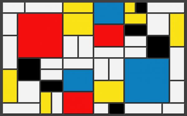
Another major influence on the styling of flat design is minimalism. While many people believe that the terms minimalism and flat design are interchangeable, minimalism had a heavy influence on art and culture before flat design was taking over the Internet. Minimalism strips down design to its core and includes only the basic elements, typically leaving a design primarily composed of clean lines and a few colors.
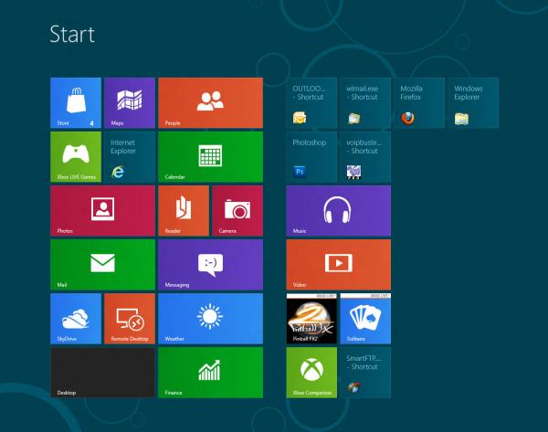
By combining these two together, you now see the modernized flat design that major companies are using today. The best example of a company using flat design is probably Microsoft, who first started using it with their Zune Media Player back in 2006. Even though the actual product was a commercial flop, it laid the groundwork for the Metro UI and design elements that they use with their products today. As you can see, there is a high focus on geometry, simple iconography, and typography throughout these designs. In 2013, Apple decided to abandon skeuomorphism and follow Microsoft’s path towards flat design with their introduction of iOS 7. Flat design is perfect for companies like Microsoft and Apple because it allows them to responsively scale their content depending on whether a user is using a desktop, tablet, or mobile device.
Hopefully by now, you can see the value in a flat design approach to creating products. But where do we go from here? Many believe that flat design isn’t going away, and even a second round of flat design elements dubbed flat 2.0 are on their way to becoming more prevalent. With that being said, the history of UX and UI tells us that something else will dethrone flat design as the savior to all of our user experience problems. Heck, even Christopher Columbus convinced people that flat wasn’t cool after people thought it was for thousands of years. Until we sail west to the unknown waters of future design, we’ll be here using flat design and all its benefits.