
The Carousel: Useful Tool or Usability Detractor?
Carousels have been used on a wide variety of websites, including e-commerce, higher education, and B2B platforms. However, there's a variance in opinion about them. We believe that carousels should generally be avoided, but they also have some practical uses to them as well.
Ever since Erik Runyon published his post on carousel statistics for the Notre Dame website, there has been plenty of debate on whether carousels are an effective way of providing navigation and information to users. Seeing that carousels are used universally on a wide variety of websites - including e-commerce, higher education, and B2B platforms - one would think the answer would clearly be yes. However, sites such as Should I Use a Carousel have fervently come out and opposed them. So what’s the verdict? We believe that carousels should generally be avoided, but they also have some practical uses to them as well.
The Bad
A distraction to users
Carousels that automatically change images every few seconds are the true culprits that give carousels their bad name. The reason people hate auto-rotating carousels can be explained by the construction of the human brain. The reptilian section - the oldest part of our brain - is primarily concerned with survival. It is responsible for split reactions and responding to quick movements in order to assess danger. Therefore, a rapid change in something (including a carousel) will inherently trigger the reptilian part of the brain and distract a user.
Banner blindness
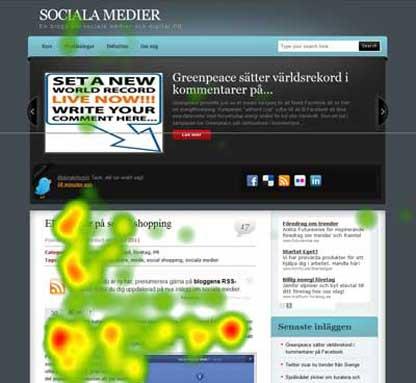
Since carousels are often implemented at the top of a screen, they are sometimes mistaken as banners. This creates a huge problem for a web page because users almost never look at anything that looks like an advertisement, whether or not it's actually an ad. As seen by this eye tracking study below, this causes users to jump right past the carousel and look for the content that they were seeking to find. If people aren’t going to look at it, what’s the point of having the prominent feature at the top of the page?
Usability issues
When creating a website, usability has to be at the forefront of a designer’s mind. Some of the issues that are created by implementing a carousel include:
-
Committing the usability deadly sin of taking the control out of users’ hands by automatically rotating slides
-
Reducing the chances that the user will retain important pieces of information, as each message is only displayed for several seconds
-
Not giving enough time to individuals browsing in their secondary or tertiary language
-
The movement aspect of a carousel’s UI decreases accessibility, especially for individuals that may have a hard time clicking call-to-action buttons before they disappear
Speed
Another negative point about sliders is that they tend to negatively affect the speed at which the pages loads. One reason for this is that most rely on jQuery and the slider script. In addition, many sliders load all of the images and information that is to be displayed in the slider on the initial page load regardless of how much the user actually interacts with it. If your page is taking forever to load, your user may leave before they even get to witness your fancy fixture on your website.
So, what are my other options?
Hero images save the day
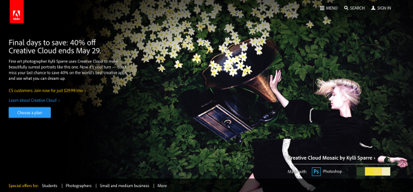
The first thing that you have to do before implementing a fixture at the top of your website is to really consider whether a carousel is even necessary. Even though using hero images may make designers feel like they are jumping back in time to the early days of the Internet, they can be effective if the imagery and messaging are powerful enough. The static nature of hero images make them less of a distraction and avoids the problem of dispersing information across multiple slides. As seen below, Adobe does a fine job of including a static hero image on the homepage of their website.
Less is more
If you decide that a carousel is perfect for your website, considering using anywhere from three to five images in your slider. While carousels are designed in hope that users will see all of the information, in reality the majority of users only see the first image and engagement rates fall off dramatically afterwards. In addition, limiting the amount of sliders makes it easier to find content that they previously discovered through the carousel.
Using carousels for display purposes
While many designers use carousels as a call-of-action tool to get users to navigate to other areas of the site, the most effective sliders are implemented for display purposes only. The type of carousels that fall under this category are ones that show multiple photos of a product, ones showing a gallery of images, or ones that show customized related items. These carousels are typically a supplementary piece of a web page and do not dominate the most valuable spots on the page.
Overall, designers need to be careful when they implement carousels. If there is carefully strategized purpose to include a carousel on a page, one must ensure that it does not significantly affect the usability and experience of the page.