ADA Website Accessibility Compliance in Higher Education
Real-world accessibility solutions have been commonplace for some time. Wheelchair accessible ramps outside of buildings, braille numbers on ATM keypads, and chirping audio cues at crosswalks are just a few accessibility features we often take for granted. How accessibility translates to the digital space, however, is a question that industries across the web are still struggling to answer. Particularly in higher education.
Real-world accessibility solutions have been commonplace for some time. Wheelchair accessible ramps outside of buildings, braille numbers on ATM keypads, and chirping audio cues at crosswalks are just a few accessibility features we often take for granted. How accessibility translates to the digital space, however, is a question that industries across the web are still struggling to answer. Particularly in higher education.
Last month, in response to a Justice Department accessability order, The University of California, Berkeley had two options:
- Update existing content to comply with accessibility standards.
- Remove more than 20,000 video and audio files from public view.
They chose the latter, the digital equivalent of boarding up the entrance to a building instead of installing a wheelchair accessible ramp.
Their decision highlights a looming issue in higher education that many institutions simply aren’t prepared to handle. How can organizations overflowing with inaccessible content ensure they remain in compliance? Are more institutions doomed to follow Berkeley’s lead and take the “it’s not inaccessible if it doesn’t exist” approach to compliance?
The University of Minnesota Duluth has compiled a list of formal complaints and outstanding court cases across dozens of colleges and universities, and it's a list that could continue to grow if other higher education institutions take Berkeley's lead.
Breaking Down ADA Website Accessibility Compliance
One of the most frustrating aspects of accessibility compliance in higher education is there haven’t been hard and fast rules to adhere to. But that’s likely changing.
In January 2017, the federal government adopted Web Content Accessibility Guidelines (WCAG 2.0) Levels of A and AA standards for all its websites. This sets a precedent going forward that will likely be adopted by the Department of Justice. In short, if your higher education site conforms to WCAG 2.0 best practices, it’s very likely you’ll be in the clear.
The WCAG 2.0 consist of 12 guidelines organized under the following four overarching principles.
Perceivable
- Provide text alternatives for non-text content.
- Provide captions and other alternatives for multimedia.
- Create content that can be presented in different ways, including by assistive technologies, without losing meaning.
- Make it easier for users to see and hear content.
The four guidelines under this category all relate to one simple question: can users with varying degrees of ability ingest the content on your site?
The first, and most approachable step for many organizations is alt-text. This refers to metadata inserted into images — usually at the CMS level — that describes the image for visually impaired users using assistive technology like screen readers. It’s incredibly easy to implement, and once you have updated the backlog of existing images, we recommend setting it as a requirement for any new images posted to your site going forward.
For multimedia content, the solutions are a less straightforward, but by no means unattainable.
Does your video content contain closed captions and/or downloadable transcripts? There are a number of free and inexpensive solutions that will allow you to create the necessary files. Youtube even has this functionality already built into its service.
If you offer audio streaming lectures, can hearing-impaired users easily access text versions of those files? If not, you might want to consider transcription software to eliminate the labor-intensive process of transcribing the files manually.
If you have a flash-based campus tour, is there a text-only alternative experience for someone with a vision impairment? Some third-party virtual tour vendors, like CampusTours, offer accessibility modules that optimize virtual tours for screen readers.
To ensure compliance, every piece of multimedia content on your site needs to be audited and evaluated, and you’ll want to start the process of transcribing that content before you receive an ADA compliance complaint, not after.
Operable
- Make all functionality available from a keyboard.
- Give users enough time to read and use content.
- Do not use content that causes seizures.
- Help users navigate and find content.
This section really drives home one of the fundamental aspects that is often missed: accessibility applies to more than just those who have vision and hearing impairments. Your site needs to be accessible to everybody, including but not limited to individuals who:
- Have lost lost some degree of limb function (whether temporary or permanent)
- Experience vertigo and other vestibular disorders
- Possess varying levels of cognitive ability
- Possess some degree of color blindness
- Are susceptible to seizures caused by bright flickering lights
Individuals visiting your site may not have the motor function required to operate a mouse. If you eliminate that input method, it needs to be possible to navigate your entire site with the keyboard alone.
To give yourself an idea of what that experience might be like, open up your college’s homepage and press the tab key 20 times in succession to navigate through the page.
- Did the progression even make sense, or did you bounce around like a ping-pong ball?
- Keep tabbing until you wind up back where you started.
- Was any content skipped over?
As you seek to make your site more accessible from the keyboard, pay special attention to things like dropdowns and calendar selectors. Both are often completely unusable without the aid of a mouse or a screen tap.
Understandable
- Make text readable and understandable.
- Make content appear and operate in predictable ways.
- Help users avoid and correct mistakes.
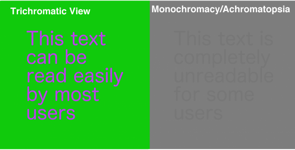
The area that organizations focus on most in this section is readability. Specifically as it pertains to color contrast. For some individuals, particularly those with some degree of color blindness, text is simply unreadable in certain background color combinations. For example, the purple text on the green background in the below image would be perfectly readable for many users, but for others it would be difficult or impossible to see any text at all.
There are a number of different tools that can help you determine where your site falls on the spectrum of compliance in regards to color contrast. Once you have pinned down your problem areas, it’s just a matter of playing around with different combinations until you settle on a color palette that’s both accessible and keeps with your own style guidelines.
It is important to note that it could simply not be possible to meet accessibility standards within the confines of your existing style guide. If you find that to be the case, you can use this as an opportunity to advocate for a larger redesign/rebranding project that allows you to put accessibility first. With accessibility issues at the forefront of the design process, it will be much easier to head off color contrast problems before they arise, instead of trying to fix them retroactively.
It’s also important not to overlook the other two guidelines in this section. The requirement that “content appear and operate in predictable ways” is particularly important for those with accessibility needs, but it should really apply to all users. For example, when a user highlights a full week in a calendar, the expectation is that a date range will be selected. If you create a calendar where only the first or last date in the range is selected — and that fact isn’t readily apparent to the user — it’s not going to be a good experience for the user, regardless of their accessibility needs.
You also need to consider what mistakes your users could make while interacting with your site and help them avoid them entirely where possible and easily correct them when necessary. Using the same calendar example above, a pop-up message that warns the user that it is not possible to set a date range would be perfectly adequate for most users — but could be a disaster for those with limited vision. Particularly if the text for the error message is too small, or displayed as an image. The better approach might be to use large text to alert the user that only a single-date can be input at the outset, before any selection is attempted.
Robust
- Maximize compatibility with current and future user tools.
Assistive technology is advancing by leaps and bounds, and your site needs to adapt in step with new hardware and software tools. Text to speech software has already eclipsed human typing speed and accuracy on mobile devices, and it’s likely that input method will become more popular among all users, regardless of their accessibility needs.
The good news is although there are a number of different assistive devices available to users, they generally behave in similar and predictable ways provided you adhere to best practices like content linearization and consistent HTML structuring.
Putting ADA Web Accessibility First
Armed with an understanding of the 12 WGAC 2.0 guidelines, you’re in a great position to deliver a better site experience for all your users. And that process can begin immediately.
Remember — as with most things — accessibility problems are easier to address before they manifest on your site, not after. Your best defense against a compliance complaint is to incorporate accessibility planning into your daily, monthly, and yearly site planning. That way, if your institution finds itself in a situation similar to that of The University of California Berkeley, you won’t have to hide your inaccessible content — because you’ll already have the tools in place to fix it.